Design Breakdown That Roasts Royalty
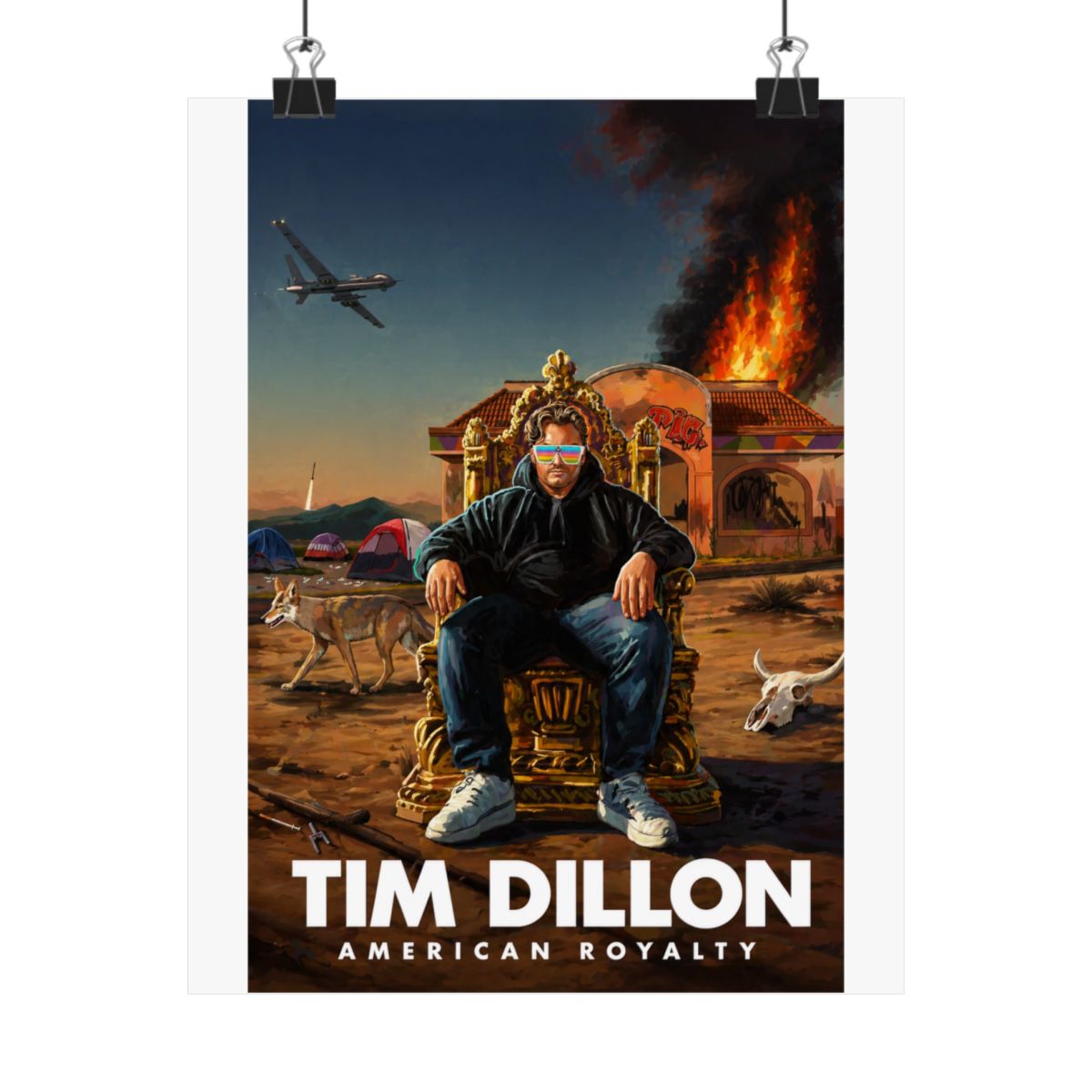
Picture this: a poster that takes the dusty crowns of European royalty and shoves them into a woodchipper labeled 'America.' The American Royalty Tour Poster from The Tim Dillon Show does exactly that. At its core, bold gold lettering screams 'American Royalty Tour' like a Vegas marquee gone rogue - think Elvis meets Marie Antoinette if she survived the guillotine and started a podcast. Tim Dillon's smirking mug dominates the center, flanked by satirical icons: eagles clutching scepters, stars - and - stripes thrones, and maybe a burger in place of the orb. It's not subtle. This thing roasts the pomp of kings with the grease of fast food excess, capturing Tim's take on how we traded divine right for drive-thru divinity.
Zoom in on the details that make it pop. The color palette? Heavy on metallic golds that gleam under any light, mocking the gold leaf on old portraits while nodding to Tim's unfiltered rants about elite decay. Typography mixes gothic flair for the 'royalty' bit with blocky sans-serif for 'American,' ensuring it hits like a Dillon punchline - elegant until it isn't. Background gradients fade from royal purple to trashy neon, symbolizing the slide from Versailles to Vegas. Sickos know this isn't random; it's Tim's visual thesis on how we're all peasants with Netflix crowns now. Print quality holds up too - crisp edges, no bleed, on thick stock that feels premium without pretending to be.
What elevates it beyond fan swag? The irreverence baked in. No bland tour dates list here; instead, subtle Easter eggs like 'Sicko Supreme' scrawled in the corner reward diehards. It's a conversation starter disguised as decor, perfect for walls that need edge. Compare it to standard comedy posters - those limp caricatures - and this stands tall, roasting harder than Tim on a bad day.