Savage Design Breakdown of American Royalty Tour Poster
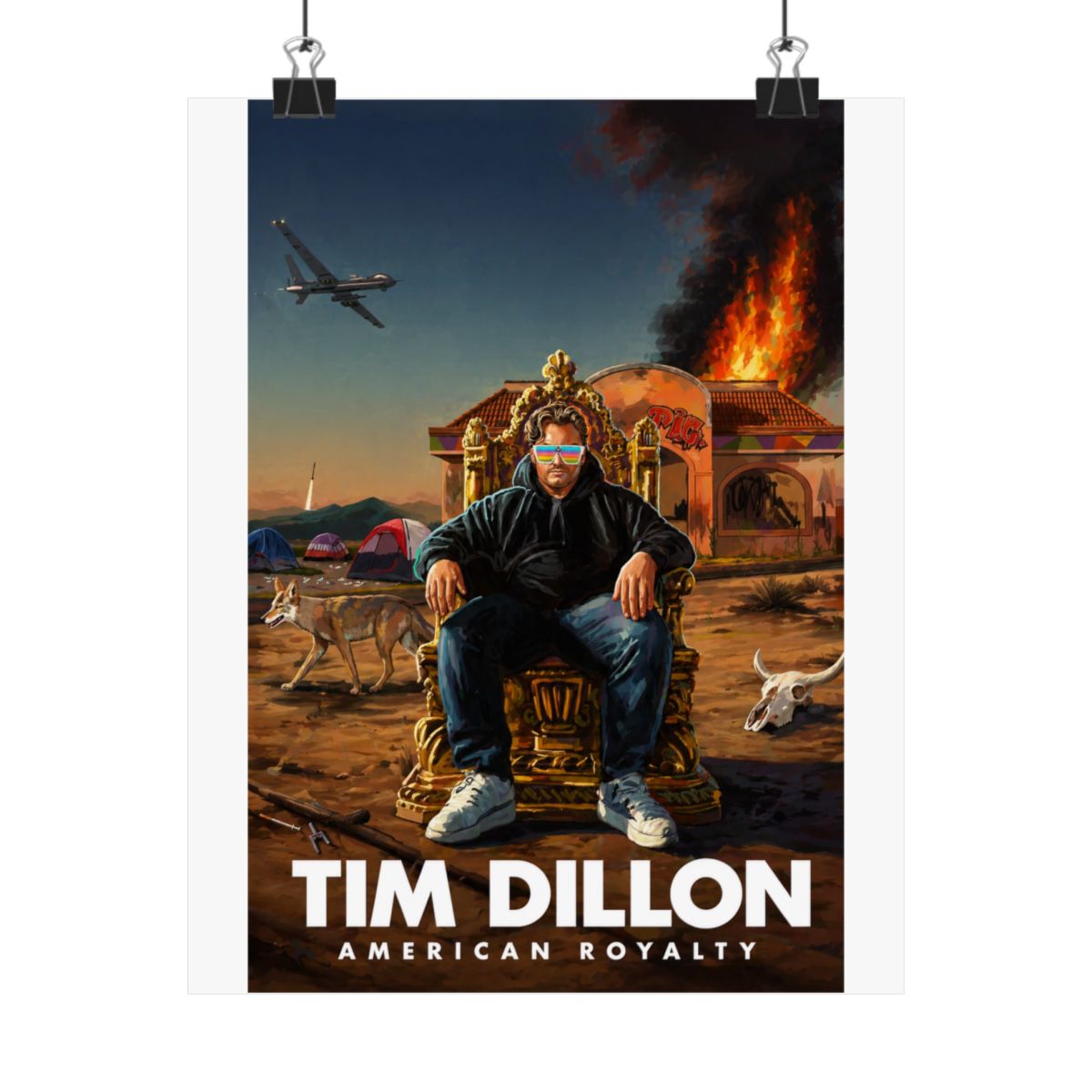
Picture this: you're staring down a poster that screams Tim Dillon's unfiltered chaos. The American Royalty Tour Poster hits like a gut punch of royal absurdity - think crowns dripping with irony, bold reds and golds clashing like a monarchy on bath salts. At the center, Tim's smirking mugshot vibe owns the frame, flanked by tour dates scrawled in fonts that look like they survived a bar fight. No fluffy graphics here; every line drips with that signature Dillon sarcasm, mocking American excess while crowning it all 'royalty.'
Dig deeper, and the details reveal pro-level print work. High-gloss stock captures the metallic sheen on those faux jewels, making it pop under any light - fluorescent office hell or dim basement lair. The color palette? Crimson dominance with black accents that nod to Tim's dark humor roots from The Tim Dillon Show. It's not some mass-produced trash; the composition balances negative space perfectly, drawing your eye from the explosive title 'American Royalty' down to the fine print tour stops. Sickos know this ain't random - it's engineered to trigger that instant 'what a time to be alive' chuckle.
What elevates it beyond basic tour swag? Subtle Easter eggs for diehards, like hidden references to Dillon's rants on elite clowns and fast-food empires. Print quality holds up to scrutiny - no bleeding inks or pixelated edges, even up close. If you're framing this beast, the borders are forgiving, sized at 24x36 inches for standard frames without custom cuts. This poster's design isn't just visual; it's a conversation starter that roasts anyone who glances at it.